Handling responsive images can be a bit challenging, especially for a beginner. But there are always a lot of ways in dealing with this challenge. In this article, we will see how you can set Drupal 7 to provide the right image for the right device. You would not want to waste the user’s time (and bandwidth) by providing a large version of the image if a mobile device is being used. So let’s discuss about a better solution: Picture module of Drupal 7. With this solution, you would be able to provide a small version of an image to a mobile device and a larger version of the same image to a larger device.
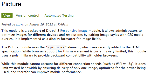
Picture module is a part of Drupal 8 core, the Drupal 7 version is a backport of it. This module will deliver alternate image sources based on device capabilities to prevent wasted bandwidth and optimise display for both screen and print.
Along with picture module, we will also be using a breakpoint module. We define different image style for specific screen sizes (breakpoints), and you define breakpoints using the breakpoint module.
Step 1. Download and enable picture module and breakpoint module.
Nothing special here, just like every other module: download and enable.
If you are using drush (http://www.drush.org), download and install the picture module and it’s dependency breakpoint module by running the following commands in your terminal.
$ drush dl picture
$ drush en picture
$ drush dl breakpoints
$ drush en breakpoints
If you are not using drush, you can also download the two modules manually at https://www.drupal.org/project/breakpoints and https://www.drupal.org/project/picture.
Step 2. Configure breakpoint for the picture module
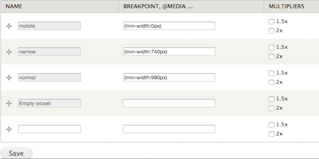
A. After the picture module and it’s dependencies had been downloaded and enabled, go to Configuration » Media (/admin/config/media) then click breakpoints. Add the custom breakpoints. Once the breakpoints had been entered, we should see the page similar below.
We set the smallest breakpoint to 0px minimum to ensure that we can accommodate arbitrarily small screen sizes. For responsive design, the preferred order of breakpoints is using minimums in decreasing order. In this example, I am using classic breakpoints for responsive designs:
- Mobile: from up to 739px
- Tablet: from 740px to 979px
- Desktop: 980px and above
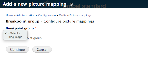
B. After breakpoints had been set, click on ‘add new group’. Enter a name in the ‘Group name’ field. You can call the group based on what you are using it for. For this tutorial, we will call our group ‘ Blog image.’ Select all the breakpoints then click ‘Save’.
Step 3. Configure picture module
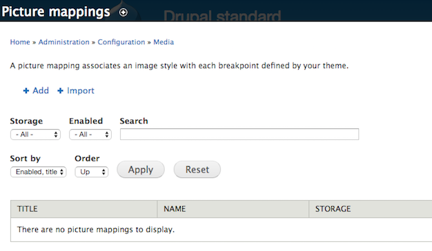
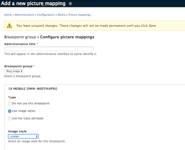
We had just configured three breakpoints, next we will be assigning image styles to these breakpoints. In the toolbar, go to Configuration » media and click on 'Picture mapping' and click on 'Add'.
After clicking on 'add', a dropdown will appear, click on 'blog images'.
Assign image styles to specific breakpoints.
Step 4. Configure field formatter in content types.
Go to Admin » Structure » Content types.
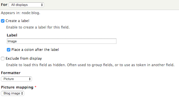
Click on your content type, for example ‘Articles’, then click on ‘Manage display’ tab.
Select the picture formatter from the dropdown.
Select 'blog image' from the picture formatter dropdown.
In the view, click on 'Fields' then Content: Image.
In formatter dropdown, choose 'picture'.
This is it! You now have optimised your images, and this will work on all devices!
Tune in to the next article: Responsive Images with Drupal 8.
Learning responsive images with drupal but still don't know the twist and turns of with image styles?
http://redcrackle.com/blog/how-create-and-use-drupal-7-image-styles.
Learn the basics on how to tweak the defaults in adding images to your Drupal site
Learn how to work with inline-images for your Drupal site